Every second, a potential donor leaves a charity website without giving. Why? Because the story isn’t told right. Your nonprofit has an incredible mission. You’re changing lives, solving problems, creating real impact. But if your website doesn’t communicate that viscerally, emotionally, compellingly—that impact stays invisible.
The data is stark: nonprofits with well-designed websites see 40% higher donation conversion rates than those with outdated or poorly structured sites. In London, where competition for charitable giving is fierce, your web design isn’t a nice-to-have. It’s your frontline fundraising tool. This is about more than aesthetics. It’s about psychology, trust, storytelling, and technical excellence working together to turn website visitors into committed donors.
This guide covers everything: from crafting donation pages that convert, to building trust with donors, to optimizing every element for maximum giving. Whether you’re a small local charity or a large national organization, these strategies will help you raise more money online.
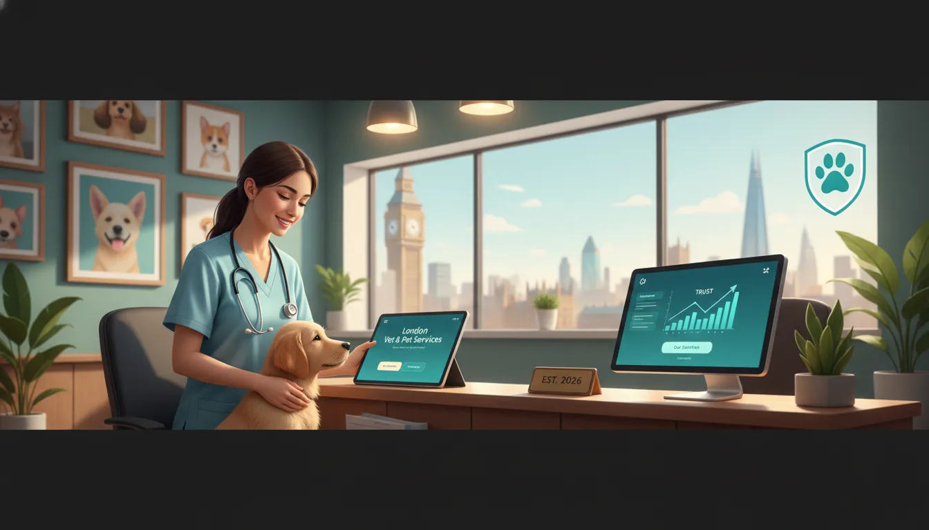
What Is Charity Web Design and Why It Matters for London Nonprofits
Charity web design is a specialized discipline that goes far beyond making a nonprofit website look nice. It’s about creating a digital ecosystem that builds trust, tells your impact story compellingly, removes friction from the donation process, and ultimately converts casual visitors into recurring donors.
Unlike commercial websites designed to sell products, charity websites have a different job. Yes, they need to convert. But what they’re “selling” is belief in your mission, trust in your organization, and confidence that a donation will genuinely help. The psychological barriers are different. The objections are different. The design approach must reflect this.
In London specifically, you’re operating in an environment of exceptional nonprofit saturation and donor sophistication. London donors have access to impact data, charity ratings, and multiple digital touchpoints. They expect professional, accessible, mobile-friendly experiences. They want to see proof of your impact. They want transparency about how their money is used. And they want the donation process to be frictionless—no clunky forms, no hidden fees, no hassle.
A proper charity web design strategy addresses all of this. It combines storytelling, psychological principles, technical best practices, and user experience optimization. The result: a website that doesn’t just look good, but actively persuades people to support your cause.
The Psychology of Donor Conversion: Why Storytelling Wins
Humans don’t donate to statistics. They donate to stories.
When a donor sees “our program helps 500 children annually,” that’s information. When they read about Marcus, a 9-year-old who went from struggling in school to becoming a confident leader through your mentoring program—complete with his story, his photo, his quote—that’s emotion. That’s connection. That’s donation.
Research from Stanford University shows that personal narratives increase donation likelihood by up to 40% compared to statistical appeals alone. In the context of a London charity website, this is critical. Your visitor has perhaps 30 seconds to decide whether they care enough to scroll further. A powerful story, told visually and verbally, captures their attention in that critical window.
Effective donor storytelling follows this structure:
1. The Problem – What challenge exists? Paint a vivid picture. “Children in East London grow up without access to safe after-school spaces” is better than “Youth engagement is low.”
2. The Individual – Introduce a real person affected by the problem. Share their name, age, background, a photo, and their specific struggle. Make them human, relatable, and specific.
3. Your Intervention – Show exactly what your charity did. The programs, the support, the resources. Be specific about your role.
4. The Transformation – How did this person’s life change? What’s different now? What’s their quote about the experience?
5. The Impact Multiplier – Help the donor understand that their gift makes this possible for many more people. “With your £25 donation, we can provide mentoring to another young person like Marcus.”
This structure works because it follows the hero’s journey narrative that humans are hardwired to respond to. Your donors aren’t the hero—the beneficiary is. Your charity is the guide. The donor’s gift is the catalyst that changes everything.
On a practical level, this means your charity website needs dedicated real estate for beneficiary stories. Not small case studies buried in a PDF. Prominent, emotionally engaging stories with photos, videos, and donor quotes. This is where conversion happens.
Building a High-Converting Donation Page: The Essential Checklist
Your donation page is the most important page on your website. Everything else exists to drive traffic to this page. It deserves meticulous attention.
A high-converting charity donation page isn’t beautiful by accident. It’s the result of careful strategic planning, psychological understanding, and relentless testing. Here’s the complete checklist:
Donation Page Essentials Checklist:
– Clear, Compelling Headline – Your H1 should answer “Why should I donate right now?” Examples: “Help us reach 100 more families this year” or “Your gift provides hope to homeless youth in London.”
– Trust Badges and Seals – Display your Charity Commission registration clearly. Include Charity Navigator, Guidestar, or similar rating badges. Show that you’re verified, registered, and accountable. This element alone can increase donation likelihood by 25%.
– Transparent Impact Statement – Explicitly state how money is used. “78% of funds go directly to program delivery” builds confidence. If you’re below 70%, be honest and explain why operations/overhead are necessary.
– Multiple Giving Options – One-time donation, monthly giving, tribute gifts, legacy giving. Different donors prefer different methods. Offer them all.
– Suggested Donation Amounts – Don’t make donors think about how much to give. Provide clear options: “£15 feeds a family for a week,” “£50 provides a laptop,” “£250 sponsors a child’s education for a term.” Research shows suggested amounts increase donation size by 20-30%.
– Gift Aid Checkbox – This is critical for UK charities. Gift Aid lets eligible donors increase their gift by 28% at no extra cost. Many donors don’t know about it. Make it prominent and explained. Include a simple explanation: “If you’re a UK taxpayer, we can claim Gift Aid on your donation, increasing its value by 28% at no cost to you.”
– Security Badges – SSL certificate indicator, payment processor logos, security messaging. Donors need to feel their payment information is safe. Display these prominently.
– Donor Testimonials – Don’t just show impact stories. Show other donors’ experiences. “Donating to [charity] is the most effective way I’ve found to help in London” carries weight.
– Progress Bar – If you have a campaign goal (“Help us reach £50,000 to expand to South London”), show progress. Visual progress increases urgency and demonstrates momentum.
– Minimal Form Fields – Only ask for information you genuinely need. Every form field you add decreases completion rate by 5-7%. If you need data for donor relationship management, capture it after the donation.
– Mobile Optimization – At least 50% of donations now come from mobile devices. Your donation page must be perfectly optimized for phones and tablets. Large buttons, readable text, minimal scrolling.
– Exit-Intent Popup – If a visitor is leaving without donating, show a final message. This can recover 2-5% of abandoners.
– Thank You Page – After donation, don’t just say “thanks.” Give them what comes next. When will they receive a receipt? How will they hear about impact? How can they follow your social media? How can they share their donation? This is the moment to build long-term engagement.
– Accessibility Compliance – Your donation page must meet WCAG 2.1 AA standards. This includes proper color contrast, alt text for images, keyboard navigation, and screen reader compatibility. It’s both ethical and legally important in the UK.
The donation page checklist isn’t theoretical. Each element has been tested and proven to increase conversion. Missing any of these is leaving money on the table.
Crafting Compelling Beneficiary Stories: The Art and Science
Beneficiary stories are the emotional engine of your fundraising. They transform abstract mission into concrete human impact. They make donors feel the difference their money makes.
Effective beneficiary storytelling requires both art and rigor. You need authentic human stories, but presented with strategic intention.
The Story Collection Process:
Start by identifying 3-5 compelling individual stories from your beneficiaries. These should represent your typical impact: diverse backgrounds, different age groups, different program types if you offer multiple programs. Each person you feature should have experienced genuine transformation.
Interview each person deeply. Spend time with them. Understand their full journey. Ask questions like:
– What was life like before your program?
– What was your biggest challenge?
– What changed because of our intervention?
– What’s your life like now?
– What do you want people to know about your experience?
– What’s your message to donors?
Record these conversations if possible. You’re looking for authentic quotes, emotional moments, and honest reflection. The best quotes aren’t polished. They’re real. “I didn’t think I could do it, but they believed in me when nobody else did” is more powerful than “This program was transformative.”
Presenting Stories on Your Website:
Don’t bury these in a case study PDF. Make them visual, prominent, and engaging.
Story Format Options:
1. Video Testimonials – The most powerful format. A 60-90 second video of a beneficiary talking about their experience beats any written text. It builds human connection. Ensure professional production quality but keep it authentic (no over-polished corporate feel).
2. Illustrated Case Studies – A dedicated landing page for each story. Header image of the person, their name, age, background, then the full narrative, with quotes highlighted, and how donor gifts made the difference.
3. Photo + Quote Carousel – On your homepage or donation page, cycle through multiple beneficiary photos with powerful quotes. Simple, visually engaging, immediately builds emotional connection.
4. Before/After Transformation – Side-by-side comparison of someone’s situation before and after your program. Visually powerful and immediately communicates impact.
5. Monthly Story Series – A “story of the month” section keeps your website fresh and gives returning visitors a reason to come back. Email this to your donor base monthly.
Story Ethical Considerations:
Ensure you have explicit consent from every person featured. Explain how their story will be used and shared. Consider whether identifying information should be anonymized (sometimes a first name and age only is appropriate). Ensure the story presentation is dignified and never exploitative.
The goal is to feature real human stories in a way that honors the person’s dignity while creating genuine donor connection and motivation.
Technical Foundation: Website Speed, Mobile, and Accessibility
A beautifully designed donation page with a compelling story means nothing if it takes 5 seconds to load or doesn’t work on mobile devices.
Technical excellence is non-negotiable for modern charity websites. This is foundational.
Website Speed and Performance:
Donors are impatient. If your website takes more than 3 seconds to load, conversion rates drop 40%. If it takes 5+ seconds, half your visitors leave.
Optimize for speed through:
– Image compression and modern formats (WebP)
– Content delivery networks (CDNs) to serve assets from locations near your users
– Caching strategies (browser caching, server caching)
– Code minification and lazy loading
– Regular performance monitoring using tools like Google PageSpeed Insights or GTmetrix
Target metrics:
– Largest Contentful Paint: under 2.5 seconds
– First Input Delay: under 100 milliseconds
– Cumulative Layout Shift: under 0.1
Mobile Optimization:
Over 60% of nonprofit website traffic now comes from mobile devices. Your site must be designed mobile-first.
This means:
– Responsive design that adapts to all screen sizes
– Touch-friendly buttons and navigation
– Readable text without zooming
– Minimal horizontal scrolling
– Fast mobile page loads
– Mobile-optimized forms (large input fields, appropriate keyboards)
Test your site on multiple devices and browsers. Use Google’s Mobile-Friendly Test to identify issues.
Accessibility for All Donors:
An estimated 1 in 6 UK adults have some form of disability. Making your website accessible expands your donor base while being the right thing to do.
Critical accessibility requirements:
– Color Contrast – Text must have sufficient contrast against its background (WCAG AA standard requires 4.5:1 ratio for normal text)
– Alt Text for Images – Every image needs descriptive alt text so screen readers can convey meaning
– Keyboard Navigation – All functionality must be usable via keyboard alone
– Form Labels – Every form field must have a properly associated label
– Heading Structure – Use H1, H2, H3 tags properly for document structure
– Video Captions – All video content needs captions
– Font Legibility – Avoid very small fonts, ensure sufficient line spacing
Use tools like WAVE, Axe, or Lighthouse to audit accessibility. Aim for WCAG 2.1 AA compliance minimum.
Building Trust: The Critical Elements Every Donor Expects
Trust is the currency of charitable giving. A donor is literally handing you money to accomplish something. They need to believe you’ll actually do what you say.
On your website, trust is built through multiple signals working together:
Transparency About Impact:
Your website should clearly state:
– How many people you helped last year (specific numbers)
– Documented outcomes and results
– Annual reports and financial statements (linked on your site)
– How donations are used (programmatic breakdown)
– What percentage goes to overhead
Don’t hide this. Feature it. Transparency is your competitive advantage against donor skepticism.
Charity Registration and Verification:
Prominently display:
– Your Charity Commission registration number
– A link to your profile on the Charity Commission website
– Ratings from platforms like Charity Navigator or Guidestar
– Any relevant accreditations
Make these clickable links so donors can verify your information independently.
Clear Leadership and Team:
Feature your team. Show photos and bios of key leadership. Beneficiary storytelling is important, but donors also want to know the people running your organization are competent, trustworthy, and genuinely committed.
Include staff photos on your team page. Include brief bios mentioning relevant experience. This humanizes your organization.
Contact and Responsiveness:
Make it genuinely easy to contact you:
– Multiple contact methods (email, phone, contact form)
– Response time commitment (“We respond to inquiries within 24 hours”)
– Clear mailing address
– Active social media channels
– Newsletter signup with clear opt-in
Responding promptly to donor inquiries is one of the highest-ROI activities for nonprofits.
Risk Mitigation Language:
Be honest about challenges, not just successes:
– “We face significant challenges in…”
– “While progress has been made, much work remains…”
– “We’re learning and adapting our approach…”
This actually increases trust. Nonprofits that acknowledge challenges seem more credible than those claiming perfect success.
SEO and Discoverability: Ensuring Donors Find You
Having an incredible website means nothing if potential donors can’t find it.
Search engine optimization ensures that Londoners searching for charities aligned with your mission actually discover your organization.
SEO Strategy for Charities:
1. Keyword Research – Identify search terms potential donors use. These aren’t always obvious. Your target might be searching “help homeless youth London” not “youth homelessness nonprofit.” Use tools like Google Keyword Planner, Ahrefs, or SEMrush to identify realistic keywords.
2. **