Every day, hundreds of potential customers land on tech company websites and leave without taking action. They don’t click the demo button. They don’t sign up for the free trial. They don’t even read past the headline. The reason? Most tech websites are built by developers, not conversion strategists. They prioritize features over benefits. They confuse visitors instead of guiding them. They forget that a well-designed SaaS website can increase conversion rates by 20-35%—without spending more on ads.

This is the reality facing London-based tech companies and SaaS founders right now. You’ve built an incredible product. Your engineering team is world-class. Your funding is solid. But your website? It’s leaving money on the table.
We’ve worked with over 200 London businesses, including dozens of tech companies and SaaS platforms. We’ve seen what works. We’ve tested what doesn’t. And we’ve documented exactly what separates websites that convert from websites that fail. The difference isn’t complexity. It’s clarity. It’s strategy. It’s understanding your customer’s journey from the moment they land on your homepage until they hit that conversion button.
Key Takeaways
In this guide, we’ll walk you through everything you need to know about professional web design for tech companies in London. We’ll cover the psychology of SaaS website design, the exact structure that converts, the tools you need, and real-world case studies from businesses just like yours. By the end, you’ll understand why website design is the highest-ROI investment a tech company can make—and how to ensure your site actually drives growth.

—
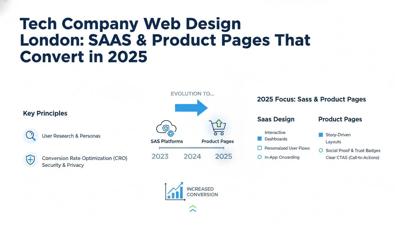
What Makes Tech Company Web Design Different?
Tech company websites live in a unique space. Unlike traditional service-based websites, SaaS and product platforms must solve multiple problems simultaneously. You need to educate visitors about a complex product. You need to build trust with decision-makers and engineers. You need to qualify leads and guide them toward a specific action (demo, trial, purchase). And you need to do it all while competing against hundreds of other options.
The core differences between tech web design and other industries:
Complexity vs. Clarity Trade-off — Your product might be technically sophisticated, but your website must be simple. Visitors should understand your value proposition in under 5 seconds. This requires ruthless prioritization. Every element on your page must serve a conversion goal.
Multiple Buyer Personas — Tech sales involve multiple decision-makers. The developer wants technical details and API documentation. The CTO cares about security and scalability. The CFO wants ROI and pricing transparency. The CEO wants proof that your solution solves a real business problem. Your website must speak to all of them, on separate pages, without overwhelming a first-time visitor.
Product-Centric Messaging — Unlike agencies or consultancies, SaaS companies sell products. This means your website must showcase features, benefits, integrations, and use cases. It’s not about your team’s story (though credibility matters). It’s about what the product *does* and why users should care.
Conversion Over Vanity — A beautiful tech website that looks amazing on Pinterest but converts at 0.5% is a liability. Effective tech web design prioritizes conversion rate over aesthetics. We test every headline, button, and image to ensure it moves the needle on actual business metrics.
Technical Requirements — Tech company websites often need to integrate with tools like Slack, Zapier, HubSpot, or Stripe. They need to support multiple languages, accept complex sign-up flows, and handle security certifications. Standard website builders don’t cut it.
This is why generic templates and freelance designers often fail for tech companies. You need someone who understands SaaS, conversion psychology, and the specific needs of London’s competitive tech market.
—
Step 1: Research Your Visitors and Define Your Conversion Goals
Before designing a single pixel, you need to understand exactly who will visit your website and what you want them to do.
This isn’t guesswork. Most tech companies make assumptions about their audience. They assume developers care about features. They assume CTOs prioritize security. They assume price-sensitive buyers will always choose cheaper options. Some of these assumptions are right. Many are wrong.
The first step of any effective web design project is user research. This involves talking to your actual customers and prospects. Not in a survey. Not through analytics. Through direct conversation.
Here’s the exact research process we recommend:
1. Interview 10-15 existing customers — Ask what problem they had before your product. What other solutions did they consider? What convinced them to buy? What almost stopped them? Where did they get stuck in the onboarding process?
2. Interview 5-10 prospects who didn’t buy — This is the uncomfortable conversation, but it’s the most valuable. Why didn’t they choose your product? Was it price? Was it missing features? Did they not understand the value? Did they choose a competitor?
3. Map out your buyer journey — From the moment someone realizes they have a problem to the moment they become a paying customer, what steps do they take? How long does the cycle last? Who are the influencers in the decision?
4. Define your conversion goals — Are you optimizing for free trial sign-ups? Demo requests? Enterprise sales calls? For most SaaS companies, different products have different goals. A project management tool might optimize for free trial sign-ups (quick activation, fast time-to-value). An enterprise security solution might optimize for demo requests (longer sales cycle, higher consideration time).
Once you’ve completed this research, you can identify your primary conversion goal (the action that matters most) and your secondary conversion goals (sign-up, download, contact form).
Real-world example: We worked with a London-based API platform. They initially thought their website should optimize for sign-ups. Through user research, we discovered that 80% of sign-ups were from hobbyists and students who never became paying customers. The real value came from demo requests from CTOs at mid-market companies. We redesigned the entire site to qualify visitors upfront and guide high-intent prospects toward demo requests instead. Sign-ups dropped 40%. Revenue increased 280%.
—
Step 2: Build a Conversion-Focused Information Architecture
Once you understand your visitors, you need to structure your website to guide them toward conversion.
Most tech websites have the wrong architecture. They’re organized around the company’s internal structure (Product, Pricing, About, Contact). Your website should be organized around your visitor’s journey. What questions do they ask at each stage? What information do they need to move forward?
Here’s the conversion-focused architecture we recommend for SaaS websites:
Homepage — 5-10 seconds to communicate three things: What is this product? Who is it for? Why should I care? Your headline should be customer-focused, not feature-focused. “Manage your entire workflow in one place” (feature) vs. “Ship features 3x faster with our collaborative workspace” (benefit). The homepage should guide visitors toward the most relevant section: Are you a startup or enterprise? Are you evaluating or ready to buy?
Solution Pages — Most SaaS products solve multiple problems for different teams. A project management tool helps engineering teams ship features faster. It helps marketing teams manage campaigns. It helps operations teams track processes. Create dedicated pages for each use case. Each page should show how your product solves that specific problem, with proof points from similar customers.
Product Pages — This is where you show, not just tell. Use screenshots, videos, and interactive demos to show your product in action. Organize features into categories (user management, reporting, integrations, security). For each feature, explain the benefit (why this feature matters) before diving into details.
Pricing Page — Be transparent. Show what’s included in each plan. Use comparison tables. Include ROI calculators when possible. Most importantly, explain the value that justifies your price. Don’t hide pricing. Companies that hide pricing convert worse than companies that display it, even if the price is higher.
Social Proof — Create dedicated sections for case studies, testimonials, and customer logos. Show before/after metrics. Include the customer’s name, company, and specific results. “Increased efficiency” is vague. “Reduced deployment time from 4 hours to 20 minutes” is proof.
FAQ & Support — Anticipate objections. What concerns do prospects have before buying? Can’t integrate with our existing tools? Worried about data security? Concerned about implementation time? Address these head-on.
Call-to-Action Pages — If your primary conversion goal is a demo request or trial sign-up, create dedicated landing pages for different segments. A page for startups will look different from a page for enterprises. Tailor the messaging, social proof, and friction level to each segment.
This architecture does one thing: It guides different visitors through different paths to the same conversion goal. A startup CEO and an enterprise CTO will visit different pages. But they’ll both end up clicking the demo button or starting a trial.
—
Step 3: Design for Conversion, Not Just Beauty
This is where most tech website projects go wrong. The designer creates something beautiful. It wins awards. It looks amazing on Dribbble. But it converts worse than the old website.
Why? Because aesthetics and conversion are often at odds. A stunning video background distracts from your headline. A minimal design with huge whitespace looks elegant but buries your value proposition. An innovative navigation pattern confuses visitors.
Conversion-focused design follows a few core principles:
Visual Hierarchy — Your headline should be the largest and most prominent element. Your value proposition should be the second most prominent. Your call-to-action should stand out with color and size. Everything else is supporting detail. Too many tech websites treat all information equally, which means nothing stands out.
Contrast and Clarity — Use contrast to guide the eye. Dark backgrounds with light text, or vice versa. Colorful buttons against neutral backgrounds. White space around key information. This isn’t about being minimal. It’s about making important information stand out.
Trust Signals — Tech prospects are cautious. They want to know you’re legitimate, secure, and reliable. Include trust signals: customer logos, security certifications, data privacy badges, team photos, founded date, funding information. If you’re a Series B startup, say so. If you’re a bootstrapped company with 100,000 users, say so. If you’re SOC 2 compliant, say so.
Friction Reduction — Identify every barrier between a visitor and conversion. Does your sign-up form ask for 10 fields when you only need 3? Are your CTAs (calls-to-action) buried at the bottom of a long page? Do you require credit card information for a free trial? Do you ask visitors to create a username and password when SSO is available? Reduce friction at every step.
Mobile-First Design — 60-70% of web traffic now comes from mobile devices. If your website doesn’t work perfectly on mobile, you’re losing conversions. Mobile-first design means designing for small screens first, then adding features for larger screens. This forces prioritization and clarity.
Proof and Social Proof — Don’t just claim benefits. Prove them. Use metrics, testimonials, case studies, and customer logos. A prospect is 63% more likely to convert if they see relevant social proof. “Enterprise-ready” is a claim. “Trusted by 2,000+ companies including Slack, Notion, and Zapier” is proof.
Speed and Performance — A 1-second delay in page load time can reduce conversions by 7%. Tech professionals are especially impatient. If your website takes 3+ seconds to load, you’re losing visitors before they even see your content. Use image optimization, lazy loading, and content delivery networks to ensure your site loads fast on any connection.
Accessibility — 1 in 4 people in the UK have some form of disability. Building an accessible website means people with visual impairments, hearing impairments, or mobility challenges can still use your site. It’s also good for SEO and usability for everyone. Use proper heading hierarchy, alt text for images, keyboard navigation, and sufficient color contrast.
We’ve tested hundreds of design iterations for tech companies. The most effective designs are often the simplest. They’re not fancy. They’re not trendy. But they convert because every element serves a conversion goal, and nothing gets in the way.
—
Step 4: Build a Technical Foundation That Supports Growth
Your website design is only as good as the technology behind it. A beautiful website built on a slow, fragile platform will underperform a well-designed website on a robust platform.
For tech companies, we recommend:
Headless CMS or Custom Development — Website builders like Wix or Squarespace work for simple marketing sites. For SaaS companies, you need more flexibility. A headless CMS (like Contentful or Sanity) or custom-built website (React, Next.js, Vue) gives you control over functionality, integrations, and performance. You can build custom sign-up flows, embed interactive product demos, integrate with your analytics stack, and scale as you grow.
Fast Hosting and CDN — Use a modern hosting platform like Vercel, Netlify, or AWS. Use a Content Delivery Network (CDN) to serve content from servers near your visitors. For a London-based company, ensure your website is served from UK/EU servers. Speed matters for conversion and SEO.
Analytics and Conversion Tracking — Install Google Analytics 4, Segment, or Mixpanel to track user behavior. Set up conversion tracking so you know how many visitors sign up, start a trial, or request a demo. Without this data, you can’t optimize. Most tech companies underinvest in analytics, then can’t explain why their website isn’t working.
A/B Testing Capability — Use tools like Optimizely, Convert, or VWO to test variations of your site. You should always be testing something: headlines, CTAs, form fields, page layouts. Small improvements compound. A 20% improvement in conversion rate is the difference between success and failure.
Marketing Automation Integration — Connect your website to your marketing stack (HubSpot, Marketo, Intercom, etc.). When someone signs up, they should automatically enter your email sequence. When someone visits your pricing page 3 times, they should be marked as high-intent. When a prospect books a demo, the sales team should be notified immediately.
Security and Compliance — Tech buyers care about security. Implement SSL/TLS encryption, keep dependencies updated, and follow security best practices. If you’re selling to enterprises, you’ll need SOC 2, GDPR compliance, and security documentation. Have these ready to share, and mention them on your website.
The technical foundation is invisible to visitors. But it enables everything from speed to personalization to analytics. Invest in it properly from the start.
—
Step 5: Implement and Test Relentlessly
Launching your website is just the beginning. The real work is optimization.
Here’s our proven testing framework:
Week 1-2: Launch and Monitor — After launching, monitor performance across all metrics: page load speed, bounce rate, conversion rate, average session duration. Set up alerts for any drops. Fix any technical issues immediately.
Week 3-4: Identify Bottlenecks — Use session recordings (Hotjar, Microsoft Clarity) to watch how visitors use your site. Where do they get confused? Where do they drop off? Do they scroll past important sections? Are they clicking on non-clickable elements? This qualitative data is gold.
Month 2+: A/B Testing Program — Start testing variations. Test headlines, headlines, CTAs, page layouts, form fields, social proof placement, pricing presentation. Prioritize tests with the highest potential impact on conversion rate. Run tests until statistical significance (usually 500+ conversions per variation).
Monthly Optimization — Once you have data, make decisions. Which pages drive the most