The average e-commerce site loses 70% of visitors before they make a purchase. That’s not a failure on their part. It’s a design problem. Cart abandonment, slow pages, confusing navigation, and poor mobile experiences are quietly draining revenue from thousands of London e-commerce businesses every single day.
Here’s the reality: you can have the best products in the world, but if your customers can’t find them, add them to their cart, or complete checkout without friction, they’ll leave. And they’ll buy from your competitors instead.
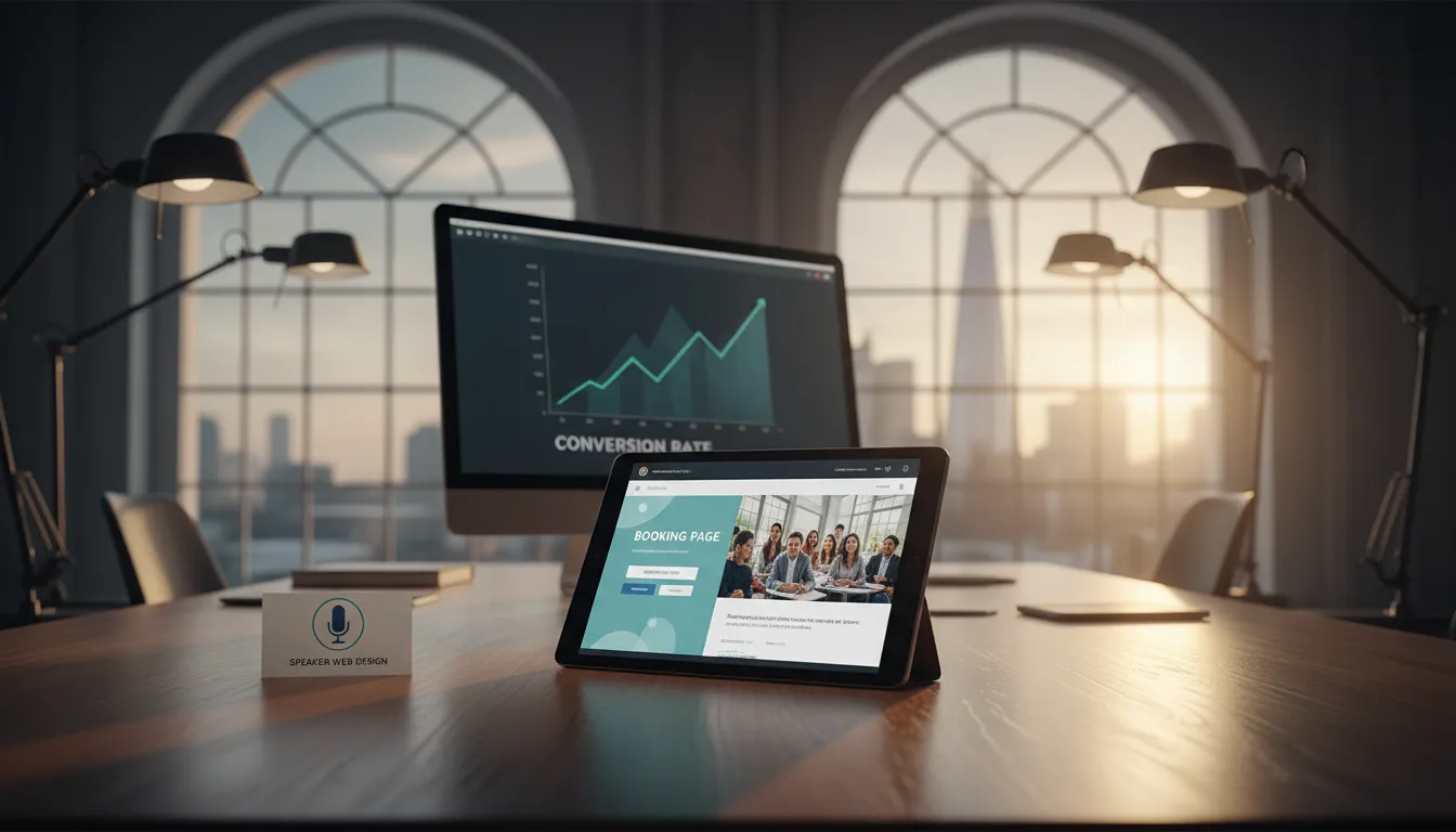
The good news? This is completely fixable. E-commerce web design isn’t about making something look pretty. It’s about creating a psychological experience that guides customers toward the purchase button. Every button placement. Every colour choice. Every loading millisecond. These aren’t accidents. They’re strategic decisions that directly impact your bottom line.
In London’s competitive e-commerce landscape, businesses that invest in proper UX design see results fast. We’re talking 40-60% increases in conversion rates within the first 90 days. Not because we use magic. Because we use proven, tested principles that work on human psychology and behaviour.
This guide reveals exactly how to transform your struggling online shop into a conversion powerhouse. Whether you’re selling fashion, food, electronics, or services, the same UX principles apply. And the best part? You don’t need to rebuild from scratch. Strategic design improvements can be live in 7 days.
What Is E-Commerce Web Design (And Why It’s Different)
E-commerce web design is fundamentally different from standard websites. A blog or brochure site can afford to be beautiful. An e-commerce site must be beautiful *and* profitable.
Standard web design focuses on presenting information. You’re showcasing who you are, what you do, and why you matter. Conversion success is measured by whether someone contacts you or subscribes to your newsletter.
E-commerce web design focuses on facilitating transactions. Every element exists to move people closer to purchase. Conversion success is measured in actual revenue generated per visitor.
This distinction changes everything about design strategy. A standard designer might create a stunning homepage with video backgrounds and elaborate animations. An e-commerce designer removes anything that doesn’t directly support the sale.
In London, where competition is fierce, e-commerce businesses can’t afford design decisions that look good but don’t perform. You need:
Fast loading speeds – Studies show 40% of users abandon a site if it takes more than 3 seconds to load. Every 100ms of delay costs 1% of conversions.
Mobile-first optimization – Over 65% of e-commerce traffic in the UK comes from mobile. Your site must be designed for phones first, desktops second.
Frictionless checkout – The average checkout process has 6-7 steps. Reducing this to 2-3 steps can cut abandonment by 30%.
Trust signals – SSL certificates, customer reviews, security badges, money-back guarantees. Without these, visitors won’t hand over payment details.
Product discoverability – Clear categories, filtering options, search functionality, and intelligent recommendations. Customers must find what they want in seconds, not minutes.
Clear call-to-actions – Your buttons must contrast with the background, use action-oriented language, and appear at strategic points in the user journey.
The difference is stark. A beautiful site that doesn’t convert is just an expensive portfolio piece. A strategically designed e-commerce site is a 24/7 salesperson working while you sleep.
The Core Elements That Drive E-Commerce Conversions
Converting browsers into buyers isn’t random. It follows predictable patterns that UX research has identified and tested thousands of times.
1. Page Speed and Performance
Here’s what happens when your site loads slowly:
– Users wait 3 seconds. Their patience evaporates.
– At 4 seconds, 40% have bounced.
– At 8 seconds, 80% have left.
In London, where customers expect premium experiences, slow sites are death. They signal incompetence. They create anxiety about payment security. They communicate that you don’t respect your visitors’ time.
Fast sites do the opposite. They build confidence. They reduce anxiety. They create momentum toward purchase.
*Tools that measure this:* Google PageSpeed Insights, GTmetrix, WebPageTest. These show exactly where bottlenecks exist.
*How to fix it:* Image optimization (compress without losing quality), minify CSS/JavaScript, implement caching, use a Content Delivery Network (CDN), upgrade hosting, and consider lazy loading for images below the fold.
For most London e-commerce sites, these optimizations reduce load time from 5-6 seconds to 1.5-2 seconds. That’s a 50-60% improvement. The conversion impact? Typically 15-25% increase.
2. Mobile-First Design
Mobile isn’t just important anymore. For e-commerce, it’s the primary experience. You design for phones first. Desktops are secondary.
This means:
– Large, easy-to-tap buttons (minimum 48×48 pixels)
– Simplified navigation (hamburger menus work, but avoid deep nesting)
– Vertical scrolling layout (not horizontal)
– Fast mobile speeds (even faster than desktop)
– Mobile-optimized checkout (guest checkout options, auto-fill enabled, minimal form fields)
The difference in behaviour is remarkable. Mobile users scroll differently. They tap differently. They abandon faster. Design must accommodate these realities.
3. Product Images and Video
This is your chance to eliminate doubt. On a physical shop, customers can touch products, see them from every angle, and understand texture and scale. Online, you must replicate this digitally.
Best practices:
– Multiple angles: 4-6 high-quality images minimum per product, showing front, back, sides, and detail shots
– Zoom functionality: Allow users to examine fine details
– Video content: 30-second product videos increase conversion by 40-80%
– Lifestyle images: Show the product being used, in context
– Size comparisons: If relevant, show the product next to everyday items for scale
Poor product images are one of the top reasons carts are abandoned. People can’t visualize the product. They don’t know if it matches their expectations. So they leave.
4. Clear Product Pages and Descriptions
Your product page is a mini sales pitch. It must accomplish several things simultaneously:
– Build desire for the product
– Remove objections (Is it good quality? Will it fit? How long does delivery take?)
– Provide information (specifications, materials, dimensions, care instructions)
– Create urgency (limited stock, sale ending soon)
– Build trust (reviews, ratings, guarantees)
The layout matters. Your most important information—the primary image, price, add-to-cart button—should be visible without scrolling on mobile.
Descriptions should balance marketing language with practical information. “Breathable performance fabric” is good. “Breathable performance fabric (92% polyester, 8% spandex, machine wash)” is better. Customers want to know exactly what they’re buying.
5. Simplified Checkout Process
Every form field you include increases abandonment. Every step in your checkout increases abandonment.
Ideal checkout:
– Guest checkout option (don’t force account creation)
– Minimal required fields (only name, email, address, payment)
– Progress indicator (shows users how many steps remain)
– One-page checkout if possible (all fields on one screen)
– Multiple payment options (credit card, PayPal, Apple Pay, Google Pay)
– Reassurance text (SSL badge, money-back guarantee, transparent shipping costs)
Many London e-commerce sites require account creation before checkout. This costs sales. New customers don’t want to create accounts. They want to buy and leave. Let them.
6. Trust Signals and Social Proof
An unknown store is a risky store. People are putting their money and personal information into your site. They need reassurance.
Effective trust signals:
– Customer reviews with images (5-star ratings with written reviews and product photos)
– Review volume (50+ reviews is significantly more trustworthy than 3)
– Security badges (Comodo, Norton, McAfee—visible on product pages and checkout)
– Money-back guarantees (30-day, 60-day, or no-questions-asked)
– Transparent policies (easy-to-find shipping, returns, privacy policies)
– Contact information (visible phone number, email, business address)
– Customer testimonials (video testimonials are exceptionally powerful)
– Trust badges (Awards, certifications, industry memberships)
E-commerce sites with customer reviews convert 20-30% higher than sites without. Video testimonials convert even higher.
7. Smart Product Recommendations
Most visitors arrive at your site with no specific product in mind. Or they find one product and don’t know what else to browse. Smart recommendations solve both problems.
Strategies:
– “Customers who bought this also bought…”: Shows complementary products (increased average order value by 15-30%)
– Best sellers: Social proof—if others are buying it, it must be good
– New arrivals: Creates urgency and encourages repeat visits
– Related products: Suggestions based on browsing history or product similarities
– Personalized recommendations: For returning customers, based on previous purchases
These aren’t just nice features. They directly increase average order value and customer lifetime value.
Step-by-Step: How to Design an E-Commerce Site That Converts
If you’re starting from scratch or redesigning an existing site, follow this framework. It’s the same approach used by London’s most profitable online shops.
Step 1: Define Your Customer and Their Journey
Before you open design software, understand who’s buying and why.
Create detailed customer personas:
– Age, location, income, job, education
– Pain points they’re trying to solve (Why do they need your product?)
– Where they shop online (What other brands do they use? What do they like about those sites?)
– Decision-making factors (Price? Quality? Brand reputation? Speed of delivery?)
– Objections (What would stop them from buying?)
– Where they’ll find you (Google search, Instagram, referral, direct)
Interview real customers if possible. Ask them why they bought. Ask them what almost stopped them. These insights are gold.
Once you understand your customer, map their journey:
1. Awareness: They discover your product (Google search, ad, social media)
2. Consideration: They research (reading reviews, comparing prices, visiting your site)
3. Decision: They add to cart
4. Checkout: They enter payment information
5. Purchase: Money changes hands
Each stage requires different design elements. Your homepage needs to immediately communicate value (for people in awareness). Your product pages need detailed information and reviews (for people in consideration). Your checkout needs reassurance and clarity (for people ready to buy).
Step 2: Plan Information Architecture and Navigation
How will customers find products?
Most e-commerce sites use this structure:
Within each category:
– Product grid view
– Filtering options (price, size, color, ratings, etc.)
– Sorting options (newest, best-selling, price low-to-high, top-rated)
– Search functionality
Navigation must be intuitive. If customers can’t find products, they can’t buy them.
Test this with real users before launch. Watch them navigate. Do they naturally find what they’re looking for? If they struggle, your structure needs adjustment.
Step 3: Design for Mobile First
Start designing on a 375px-wide canvas (standard mobile width). This forces you to prioritize. Only the most important elements fit.
Mobile-first design for e-commerce means:
– Large buttons (48px+ minimum)
– Vertical scrolling only (no horizontal)
– Hamburger menu for navigation
– Simplified header (logo, search, cart, account)
– Full-width product images
– Minimal form fields
– Large, clear pricing and “Add to Cart” button
Once mobile design is perfect, expand to tablet (768px) and desktop (1024px+). You’re adding features, not redesigning.
This approach ensures your primary audience (65% of visitors) has a flawless experience.
Step 4: Optimize Product Pages for Conversion
Every product page should include these elements in this order:
1. Primary image (large, high-quality, shows main product)
2. Thumbnail gallery (allows browsing without reloading)
3. Price and availability (clear, prominent, immediately visible)
4. Add to Cart button (contrasting color, action-oriented text like “Buy Now” or “Add to Bag”)
5. Product specifications (size, materials, dimensions, weight)
6. Product description (combines marketing language with practical information)
7. Shipping information (cost, time to delivery)
8. Return policy (money-back guarantee, timeframe)
9. Customer reviews and ratings (with images and specific feedback)
10. Related products (up-sell and cross-sell opportunities)
The most critical—your image and price—should be visible above the fold on mobile. A user shouldn’t need to scroll to see what the product is or how much it costs.
Step 5: Simplify and Test Checkout
Reduce your checkout to the absolute minimum:
Step 1: Shipping Address
– Name
– Email
– Street address
– City
– Postcode
– Country
Step 2: Payment
– Credit card details (or PayPal/Apple Pay/Google Pay)
– Billing address (offer same as shipping to reduce fields)
Step 3: Order Review and Confirmation
That’s it. Three steps. Many sites add far more.
Some best practices:
– Progress indicator: “Step 1 of 3” (shows light at the end of the tunnel)
– Continue shopping link: “Need something else?” (increases average order value)
– Save information option: For returning customers (speeds up repeat purchases)
– Reassurance text: “Your information is secure” + SSL badge
– Shipping cost transparency: Show cost before payment step (unexpected shipping kills sales)
– Confirmation email: Immediate, with order number and tracking link (reduces anxiety)
Test checkout with real users. Watch where they hesitate. That’s where friction lives.
Step 6: Add Trust Signals Strategically
Don’t scatter trust signals randomly. Place them strategically:
– Product pages: Customer reviews with images, security badges
– Checkout pages: SSL badge, money-back guarantee, contact information
– About page: Company story, team photos, awards and certifications
– Footer: Return policy, shipping policy, customer service phone number
– Homepage: Testimonials, featured reviews, trust badges
Trust signals work best when they’re specific. “5/5 stars from 2,000+ customers” is more powerful than “Highly trusted.” “30-day money-back guarantee” is more powerful than “Satisfaction guaranteed.”
Step 7: Implement Analytics and Continuous Testing
Launch isn’t the end. It’s the beginning.
Set up Google Analytics to track:
– Conversion rate: (Purchases / Visitors) × 100
– Cart abandonment rate: (Carts created – Purchases) / Carts created × 100
– Average order value: Total revenue / Number of orders
– Traffic sources: Where visitors come from
–