Here’s a sobering statistic: 78% of prospects research your business online before contacting you—yet most consultant websites fail to communicate expertise or convert visitors into leads. You’re losing retainers to competitors with better-designed sites.
This isn’t about flashy graphics or trendy animations. It’s about strategic design that builds authority, establishes trust, and compels prospects to pick up the phone. In London’s competitive consulting market, your website is the first impression that determines whether you land high-value retainer clients or get overlooked.
This guide reveals exactly how to design a consultant website that wins business. We’ll cover the psychology behind conversion-focused design, the specific elements that build authority, real-world pricing, and implementation timelines. By the end, you’ll understand why design investment directly correlates with retainer pipeline growth.
Whether you’re a strategy consultant, financial advisor, HR specialist, or business coach, the principles remain the same: strategic positioning + proven design elements + conversion optimization = retained clients.
Let’s build your competitive advantage.
What Makes a Consultant Website Different from Other Business Sites
A consultant website isn’t a portfolio showcase or a product catalog. It’s a trust-building machine designed to accomplish one core objective: convince high-value prospects that you’re worth retaining.
This distinction fundamentally changes how we approach design and content strategy.
The consultant website psychology:
Traditional business websites focus on products or services. Consultant websites focus on you—your expertise, your methodology, your track record, and your thinking. Prospects aren’t buying a service; they’re buying access to your brain, your experience, and your ability to solve their specific problems.
This creates unique design requirements:
1. Authority through positioning: Your site must immediately communicate your niche expertise. Generalist consultants struggle to command premium retainers. Specialized consultants (HR transformation, commercial real estate strategy, executive coaching) attract better-qualified, higher-paying clients. Your design should reinforce this positioning through every visual element, from color psychology to typography choices.
2. Social proof at scale: Prospects want evidence you’ve solved problems like theirs. A consultant website needs prominent case studies, client testimonials, and measurable outcomes. Generic reviews aren’t enough—you need proof that you deliver transformational results for specific client types.
3. Methodology visibility: What makes you different? Prospects want to understand your approach before investing time in conversations. Your website should explain your methodology, your process, your philosophy. This positions you as a thought leader, not just a hired gun.
4. Accessibility to decision-makers: Corporate prospects are busy. They won’t dig through pages to find information. Your consultant website must front-load credibility signals: credentials, experience, industries served, key achievements. Make it impossible to misunderstand why someone should hire you.
5. Lead quality over quantity: You don’t want 1,000 low-value leads. You want 10 high-value, qualified prospects per month. Your design and messaging should actively qualify leads, attracting your ideal client and repelling poor fits. This saves time and increases close rates.
The architecture, layout, copy, imagery, and functionality of a consultant website all serve this single purpose: moving qualified prospects from “I’ve heard of this person” to “I need to talk to this person” to “I’m retaining this person.”
This is why amateur design is so costly. A poorly designed consultant website doesn’t just fail to convert—it actively damages credibility. You’re signaling to prospects that you either can’t invest in your own business or don’t understand the importance of first impressions.
The 5 Core Elements of Authority Consultant Websites That Win Retainers
Not all consultant websites perform equally. The ones that consistently fill the pipeline with high-value retainer clients share specific design and structural characteristics. These aren’t opinions—they’re based on conversion data from hundreds of consultant websites.
Element 1: Crystal-Clear Positioning and Niche Definition
Your homepage has approximately 8 seconds to communicate two things:
– What you do (your service/expertise area)
– For whom (your ideal client)
Vague positioning kills consultant websites. “I help businesses grow” converts at nearly 0%. “I help mid-market manufacturing companies implement lean operations and reduce production costs by 20-30%” converts at 15-25%.
How authority consultant websites handle this:
Your hero section should feature a clear, specific headline that immediately answers: “Is this for me?” The best consultant websites use this structure:
*”[Specific Service] for [Specific Client Type] Who [Specific Problem/Situation]”*
Example: “Executive Coaching for C-Suite Leaders Navigating Leadership Transitions”
This positioning serves multiple functions simultaneously:
– SEO benefit: You’re ranking for specific, high-intent keywords
– Credibility signal: You understand your market deeply enough to be specific
– Qualification: Wrong-fit prospects self-eliminate
– Premium positioning: Specialists command higher rates than generalists
Below the headline, your value proposition should answer: “Why should I choose this consultant over others?” This isn’t about your credentials—it’s about outcomes. What transformation do you deliver? What problems disappear when someone hires you?
Design implementation:
The visual hierarchy matters intensely. Your positioning statement should occupy prime real estate: large, legible typography with high contrast. Most consultant websites bury their positioning in small text surrounded by unnecessary design elements. Your positioning is your most valuable real estate—treat it that way.
Supporting imagery should reinforce positioning. If you serve financial services clients, your imagery shouldn’t be generic office photos. It should feel financial. Color psychology matters here—blues and grays convey stability and authority; warmer tones suggest approachability. Your chosen palette should align with your positioning and target audience psychology.
Element 2: Social Proof That Actually Converts
Client testimonials on most consultant websites are forgettable: “Great consultant. Highly recommend.” These don’t move conversion needles because they’re generic and could apply to anyone.
Authority consultant websites use structured social proof that addresses specific prospect concerns:
Problem-Solution-Outcome case studies: Instead of “We increased revenue,” structure it: “Client had X problem → We implemented Y approach → Result was Z outcome (quantified).” Better yet, include the client name (if they permit) and a photo. Named clients with visible faces convert 3-4x better than anonymous testimonials.
Specific measurable outcomes: “Improved efficiency” doesn’t convert. “Reduced annual operational costs by £180,000 while improving team morale scores by 34%” does. Prospects mentally calculate: “If they did that for Client X, what might they do for my business?”
Industry-specific case studies: If you serve multiple industries, feature case studies from your target market. A financial services firm cares about results from other financial services firms, not generic B2B outcomes. Your website should have separate case study sections for each major vertical you serve.
Video testimonials: Written testimonials are good. Video testimonials from recognizable executives are significantly better. A 60-second video of a past client discussing their transformation (filmed professionally, not on a smartphone) conveys authenticity that text cannot.
Social proof hierarchy:
Your consultant website should layer social proof:
– Top of funnel: Number of clients served, years in business, industries represented
– Middle of funnel: Specific case studies with named clients and outcomes
– Bottom of funnel: Video testimonials, detailed project breakdowns, ROI metrics
– Decision stage: References available upon request (with 3-5 specific client contacts prospects can verify)
Design consideration: Don’t hide case studies behind a “case studies” page. Feature them prominently on your homepage and service pages. Better consultant websites feature a rotating carousel of case studies in the hero section or immediately below. This front-loads social proof.
Element 3: Methodology and Process Clarity
Prospects are making a risk assessment: “If I hire this consultant, what will happen? How will they work? What’s the process?” Authority consultant websites answer these questions before the prospect asks.
Your methodology section should address:
– Discovery phase: How do you understand the client’s situation?
– Analysis phase: What analysis or assessment do you conduct?
– Implementation/execution: What’s your approach to delivering results?
– Measurement: How do you track and communicate progress?
This serves multiple conversion purposes:
Confidence building: A clear, defined methodology signals you’ve done this before. You have a repeatable process. You’re not making things up as you go.
Differentiation: Your unique methodology is what separates you from other consultants claiming similar expertise. A financial advisor who uses a specific, proprietary planning methodology is more credible than one who “provides financial advice.”
Scope clarity: Prospects know what to expect. They understand commitment, timeline, and deliverables. This reduces perceived risk.
Design implementation:
Visual process diagrams work well here. A simple 4-5 step flow showing “Discovery → Analysis → Strategy → Implementation → Measurement” with brief descriptions creates visual hierarchy and makes your process digestible. Each step should feature:
– A clear, specific action
– What the consultant does
– What the client receives
– Approximate timeline
Some authority consultant websites go deeper, creating interactive process guides that expand on click. Others feature video walkthroughs of their methodology. The point is: don’t leave this to chance. Make your methodology visible, clear, and credible.
Element 4: Thought Leadership and Content Authority
A consultant website that only sells is a dead website. Prospects need proof you’re an active thinker in your field, not someone recycling old ideas.
Your consultant website should feature:
Regular blog content: 2-4 substantial blog posts monthly (1,200+ words each) addressing problems your target clients face. This content serves dual purposes: SEO (attracting qualified traffic) and authority building (demonstrating ongoing expertise).
Downloadable resources: Lead magnets specific to your audience—templates, frameworks, guides, checklists. “The Executive Coaching Assessment Framework” attracts higher-quality leads than “Free Consultation Offer.” Resources should be genuinely valuable, not bait-and-switch.
Published articles/media mentions: Links to articles you’ve written for industry publications or media mentions establish third-party credibility. “Featured in Forbes,” “Published in Harvard Business Review,” “Quoted in The Times” all carry weight.
Speaking engagements: Lists of conferences, seminars, or events where you’ve spoken position you as an industry authority.
Certifications and credentials: Professional designations, university affiliations, industry certifications. These matter more for some consulting niches (financial, legal, health) than others, but they’re credibility multipliers where relevant.
Design consideration: Don’t bury this content. Feature it prominently. A consultant website that front-loads thought leadership signals sends a message: “This person is a true expert, not just a sales person.”
Element 5: Frictionless Lead Capture and Clear Next Steps
Authority consultant websites don’t assume visitors will contact you. They make contact effortless.
Your website should feature:
Multiple lead capture touchpoints: Homepage CTA, service page CTAs, blog content CTAs, exit-intent offers. Different visitors convert at different moments. Offering multiple conversion paths increases total capture rate.
Clear next steps: What happens after someone submits their information? Set expectations: “You’ll receive a 15-minute consultation booking link within 24 hours” creates certainty and reduces prospect friction.
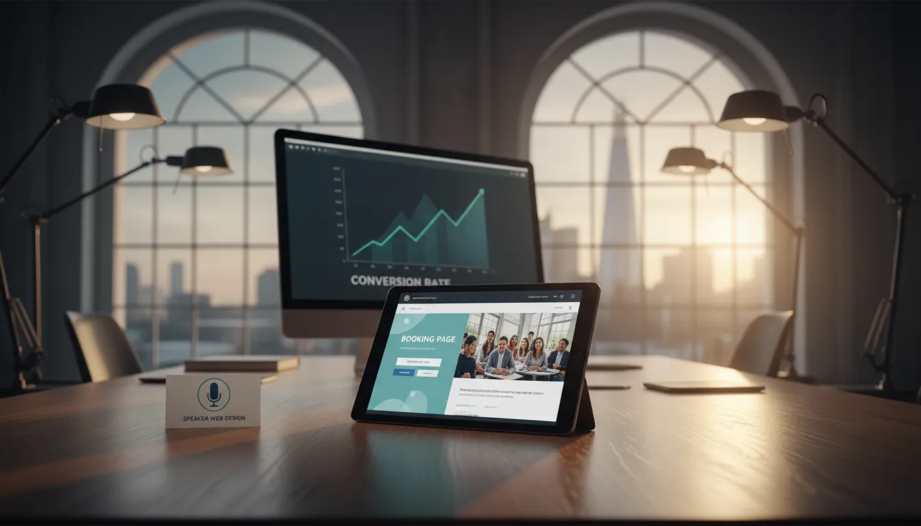
Low-friction initial contact: “Schedule a consultation” is better than “Contact us to discuss your needs.” Providing a Calendly link or booking system directly on your site eliminates back-and-forth email exchanges that kill momentum.
Trust signals at point of conversion: Before asking for an email address, ensure trust markers are visible. Display your LinkedIn profile (with impressive follower count), client logos, certifications, or a recent case study. This reduces friction at the exact moment you’re asking for commitment.
Multi-format conversion options: Some prospects prefer calendars, others prefer email forms, others want phone numbers. Offering multiple conversion methods captures everyone.
Design consideration: Your CTA (call-to-action) buttons should contrast strongly with your background. They should use action-oriented language: “Schedule Your Consultation,” “Claim Your Strategy Session,” “Get My Free Assessment.” Passive language like “Contact Us” converts worse than active language.
Your contact form should ask only essential information: typically name, email, and brief project description. Every additional field reduces conversion rates. You can gather more information during the consultation.
Step-by-Step: Building Your Authority Consultant Website from Scratch
Now that you understand the core elements, let’s walk through the actual build process. If you’re starting from nothing, here’s your roadmap.
Phase 1: Strategy and Content Development (Weeks 1-2)
Before designing a single pixel, you need strategic clarity. This phase determines everything that follows.
Define your positioning:
Answer these questions in writing:
– What’s your core consulting expertise?
– Who is your ideal client? (Be specific: industry, company size, revenue range, title, challenges)
– What specific problems do you solve?
– What outcomes do you deliver?
– Why are you different from other consultants?
– What’s your unique methodology or approach?
– What’s the financial impact of your work? (Cost savings, revenue increase, time savings, risk reduction)
This document becomes your north star. Every design decision, every word on your site, should reinforce these core positioning elements.
Develop your messaging framework:
Create a simple one-page document containing:
– Headline: Your core positioning statement
– Subheading: What transformation you deliver
– Three supporting pillars: Key differentiators or benefits
– Social proof anchors: Key statistics or achievements
– CTA messaging: The action you want prospects to take
Create your case study brief:
Identify 3-5 past projects or clients you can use as case studies. For each, document:
– Client industry and situation
– The specific problem they faced
– Your solution/approach
– Quantified results (cost savings, revenue increase, efficiency gains, time freed)
– Client testimonial (if possible, ask them directly for feedback)
This content becomes the foundation of your social proof section.
Map your service offerings:
Most independent consultants offer 1-3 core services. Define each clearly:
– Service name
– Who it’s for
– What problem it solves
– What the process looks like
– Expected timeline
– Price range or packaging
This prevents your website from becoming a confusing catch-all. Clarity converts better than trying to appeal to everyone.
Timeline: 1-2 weeks of focused thinking and documentation.
Deliverable: A 3-4 page strategy document that your designer uses as a blueprint.
Phase 2: Website Architecture and User Journey Mapping (Week 2)
Now you need to structure how visitors will experience your authority consultant website.
Define your page structure:
Most effective consultant websites include:
1. Homepage: Positioning, value proposition, social proof highlight, methodology overview, CTA
2. Service/Expertise Pages: One page per major service offering, with detailed methodology, case studies, and CTAs
3. Case Studies Page: Gallery of your best work with detailed project breakdowns
4. About Page: Your story, credentials, approach to consulting, why you do this work
5. Blog/Resources: Content hub demonstrating thought leadership
6. Contact/Get Started: Clear, simple contact form or booking system
Some consultant websites add:
7. Pricing/Packages Page: Transparent pricing for specific offerings
8. Team Page: If you have team members or partner consultants
9. Testimonials Page: Dedicated social proof page with video testimonials
Map the user journey:
Consider how different visitor types will navigate your site:
First-time visitor: Lands on homepage → Reads positioning → Reviews case studies → Books consultation
Research-phase visitor: Reads multiple service pages → Downloads lead magnet → Explores blog content → Books consultation
**Referred