Your landing page is bleeding leads. You know it. Every visitor who clicks away without converting feels like a missed opportunity. But here’s the truth that most London agencies won’t tell you: you don’t need to rebuild your entire website to fix it.
According to recent data, 88% of service businesses have at least one landing page that underperforms. The average conversion rate for UK service sector websites sits at just 2.3%. That means for every 100 qualified visitors landing on your page, roughly 97 leave without taking action. For a plumbing company, accountancy firm, or consulting practice in London, that’s revenue walking out the door.
The good news? Strategic landing page design changes—focused specifically on conversion—can increase lead capture by 40-60% without a full site rebuild. You don’t need a six-month, five-figure project. You need a targeted approach. Smart copywriting. A clear structure. And a CTA formula that actually works.
In this guide, we’ll walk you through exactly how to redesign your landing page for maximum conversions. You’ll learn the 5-section wireframe that’s driving results for London service businesses. You’ll discover the CTA formula that converts. And you’ll get practical, actionable steps you can implement immediately—whether you hire a designer or take a DIY approach.
Let’s get straight to work.
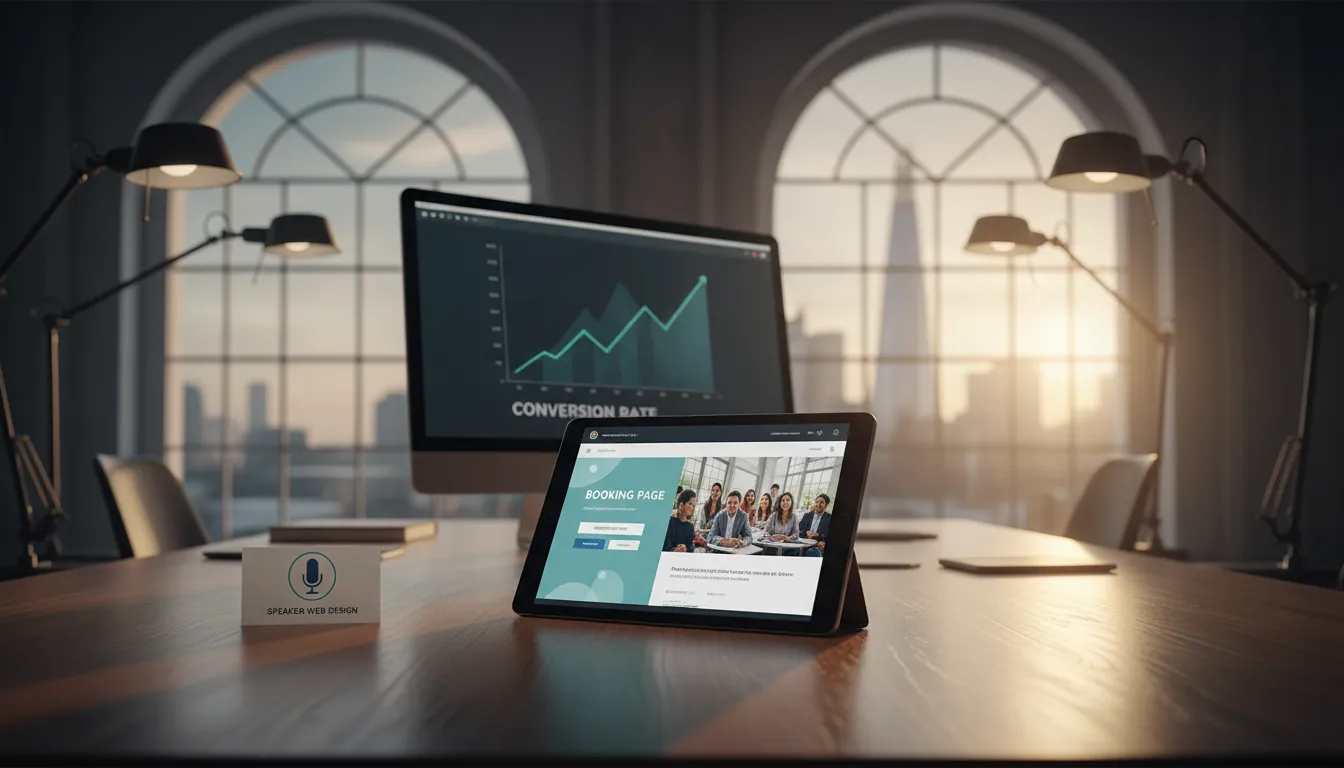
What Landing Page Design Really Is (And Why It’s Not Just About Pretty)
Your landing page isn’t a webpage. It’s a salesman. A 24/7 employee whose single job is to convince someone to take one specific action: fill out a form, book a call, request a quote, or buy something.
Too many service businesses treat their landing pages like brochures. They showcase their company history, list their services, throw in some stock photos, and call it done. That’s not landing page design—that’s just page design. And it won’t convert.
Real landing page design is about:
Clarity over creativity. Every element serves a conversion purpose. Confusing design kills sales. So does unclear messaging.
Removing friction. The faster someone understands what you offer and why they should act now, the more likely they convert.
Building trust immediately. Service businesses sell on trust. Your landing page has seconds to establish it.
Matching intent. If someone clicks an ad about “bookkeeping for restaurants,” they shouldn’t land on a generic accountancy homepage. They should land on a page that speaks directly to restaurant owners and their specific pain points.
For London service businesses—whether you’re a law firm in Mayfair, a cleaning company in Clapham, or a marketing agency in Shoreditch—landing page design means creating a focused, conversion-optimized path from visitor to lead.
The difference between a mediocre landing page and a high-converting one often comes down to structure, clarity, and psychology. You don’t need fancy animations or trendy design. You need a page that guides someone toward a decision.
The 5-Section Landing Page Wireframe That Converts
Before you make any design changes, you need a blueprint. Wireframes aren’t pretty—they’re powerful.
The 5-section structure below has been tested across hundreds of service business landing pages in London and beyond. It works because it follows human psychology. It answers objections in the right order. And it builds momentum toward the CTA.
Here’s the framework:
Section 1: Hero (The First 8 Seconds)
What it includes:
– A compelling headline (not a tagline)
– A supporting subheadline
– A visual (video, image, or illustration)
– Optional: A micro-CTA above the main one
Why it matters: You have roughly 8 seconds before someone decides whether to scroll or bounce. Your hero section must immediately answer: “Is this for me?”
Example for a London accountancy firm:
– Headline: “Tax relief for freelancers. Every. Single. Year.”
– Subheadline: “Specialist accountants saving London freelancers an average of £3,200 annually.”
– Visual: A confident freelancer working on a laptop, not a stock photo of people shaking hands.
The headline should use specific language. Avoid generic phrases like “Welcome to our services.” Instead, speak to the outcome. Use numbers when possible. The subheadline clarifies and adds credibility (notice the specific amount in the example above—that’s far more compelling than “save money”).
Your hero visual should show your ideal customer, not your office. And it should feel authentic. Professional photography or illustration beats overused stock photos every single time. If you’re in London, consider commissioning a local photographer for a few hundred pounds. The ROI is worth it.
Section 2: Problem & Solution (Build Empathy, Then Show Hope)
What it includes:
– A clear, specific problem statement
– 2-3 pain points (short, benefit-focused bullets)
– A transition to the solution
– How your approach is different
Why it matters: This section stops skimmers. It makes people think, “Wait, this is exactly my problem.” Once you’ve nailed the problem, the solution becomes irresistible.
Example for a London cleaning company targeting offices:
– Problem: “Your office is a first impression. A dirty one tanks client relationships.”
– Pain points:
– Staff are spending time cleaning instead of working
– You’re paying for mediocre cleaning services on a cycle that doesn’t match your actual needs
– Standard cleaning contracts don’t include the deep clean your carpets desperately need
– Solution transition: “We don’t do standard cleaning. We do flexible, deep cleaning that works around your schedule.”
– Differentiation: “Same team. Scheduled flexibility. Monthly deep cleans included.”
The key is specificity. Don’t write, “We understand your challenges.” Instead, name them. A London financial services firm reading “Your team is losing 6+ hours monthly to administrative chaos” will sit up and pay attention because you’ve just described their Tuesday.
This section should be 200-300 words maximum. Use short sentences. Use bullet points. Make it scannable.
Section 3: Social Proof (Build Credibility Fast)
What it includes:
– Client testimonials (with names, company, industry)
– Case study metrics (numbers are gold)
– Media mentions or awards (if you have them)
– Trust badges or certifications
– Client logos (if you have recognizable names)
Why it matters: People don’t trust you yet. They trust other people who’ve used you. Social proof collapses sales resistance.
Example elements:
– “Increased quote requests by 45% in 3 months” (from an actual client result)
– A testimonial from a named client: “We were getting maybe 2 leads per week. After working with them, we’re now seeing 6-8. The quality is better too.” — Sarah Chen, Director, Chen & Associates (Legal)
– “Featured in London Business Matters & Recommended in Trustpilot (4.8 stars)”
– A logo wall of recognizable London clients (even if they’re not household names, they’re proof you work with real businesses)
Video testimonials crush written ones. If you can get a client to record a 30-second video saying “Here’s what changed for our business,” that’s worth more than a dozen written reviews. But don’t fake it. Authenticity is non-negotiable.
Numbers always win. “We’ve worked with 200+ clients” is okay. “Our clients report an average 34% increase in qualified leads” is exceptional. If you don’t have specific metrics, ask your best clients for feedback. They’ll give you gold.
Section 4: How It Works (Remove the Mystery)
What it includes:
– A 3-4 step process (no more than that)
– Simple visuals or icons for each step
– One sentence per step
– Time required (optional but powerful)
Why it matters: People buy clarity. If they don’t understand how you work, they won’t commit. This section should remove all mystery.
Example for a London marketing consultancy:
– Step 1: Book a free 20-minute clarity call (no sales pitch, we promise)
– Step 2: We audit your current lead generation performance and map your ideal customer
– Step 3: You get a custom roadmap with prioritized actions for next 90 days
– Step 4: Implement with ongoing support, or handle it yourself
That’s it. Four steps. Nobody needs to see your full service offerings on a landing page. You can explain the nuances on a follow-up call.
Time matters more than you think. “Complete in 3 business days” or “Takes about 10 minutes” reduces friction. People commit more readily when they know what time they’re investing.
Section 5: The Call-to-Action (Make It Impossible to Ignore)
What it includes:
– A primary CTA button (sticky, visible, high contrast)
– Secondary CTA (email form or link)
– Minimal form fields (3-5 maximum)
– A trust statement below the form
Why it matters: Everything above this point is buildup. The CTA is where conversions actually happen. You can have the world’s best landing page, but if your CTA is buried, unclear, or requires too much effort, you’ll still lose leads.
The CTA Formula That Works:
The strongest CTAs follow this pattern: [Action verb] + [Specific outcome] + [Time/No friction]
Examples:
– “Get your free audit →” (instead of “Click here”)
– “Book a 20-min call (no pressure)” (instead of “Contact us”)
– “Claim your quote” (instead of “Submit”)
– “See your savings estimate in 2 min” (instead of “Learn more”)
The CTA button should:
– Use a high-contrast color (not matching your brand palette)
– Be at least 50 pixels tall
– Use action language
– Be placed above the fold (no scrolling required to see it)
– Appear again 75% down the page (after social proof)
If you’re using a form, keep it short:
– Name
– Email
– Phone number
– One question: “What’s your biggest challenge with [specific problem]?”
That’s it. Every additional field drops conversion rates by 8-10%. Long forms are conversion killers.
The trust statement below your form might read: “We respect your privacy. Unsubscribe anytime. No spam, ever.” Or “Join 500+ London businesses getting qualified leads every month.”
The CTA Formula Deep Dive: Writing Copy That Converts
Your call-to-action button isn’t just a design element. It’s a persuasive statement. The copy matters as much as the color.
Here’s the formula again with real examples:
Formula: [Benefit] + [Urgency or Specificity] + [Ease of action]
Weak: “Contact us”
Strong: “Get your free audit”
(Why? It promises a concrete benefit, not a vague action.)
Weak: “Learn more”
Strong: “See how much you could save”
(Why? It implies a specific outcome you’ll discover immediately.)
Weak: “Submit”
Strong: “Claim your strategy call”
(Why? “Claim” implies scarcity and value. “Strategy call” is specific.)
Weak: “Apply now”
Strong: “Start your 30-day free trial”
(Why? Removes barriers. You’re not asking for a commitment—you’re offering one risk-free.)
For London service businesses, here are proven formulas by industry:
Accountancy/Tax:
– “Get your free tax assessment”
– “Find your tax savings in 5 minutes”
– “Claim your tax relief guide”
Legal Services:
– “Book your confidential consultation”
– “Get your legal health check”
– “See if you have a case”
Cleaning/Facilities:
– “Schedule your free site visit”
– “Get a custom quote”
– “See our availability this week”
Marketing/Sales Services:
– “Get your marketing audit”
– “See your 90-day roadmap”
– “Book your strategy session”
Trades (Plumbing, Electrical, etc.):
– “Book your free quote”
– “Check availability this week”
– “Get same-day service”
The pattern? Specific. Benefit-driven. Easy. No jargon.
Test different CTA versions. “Get your free audit” might outperform “Book a consultation” by 30%. Test language, color, placement, and button size. Small changes yield big results.
Step-by-Step: Implementing Your Landing Page Redesign
Now you know the structure. Here’s how to actually build it.
Step 1: Audit Your Current Page (30 Minutes)
Before you redesign, understand what’s not working.
Questions to answer:
– What’s your current conversion rate? (Check Google Analytics)
– Where are people dropping off? (Scroll depth, click map, form abandonment)
– What’s your traffic source? (Organic, paid ads, email, referral)
– Who’s your ideal customer? (Company size, industry, challenge)
Use free tools:
– Google Analytics 4 (traffic sources, drop-off points)
– Hotjar (heat maps, session recordings)
– Microsoft Clarity (free alternative to Hotjar)
Spend 20 minutes watching actual user sessions. You’ll learn more from watching one person struggle with your form than from reading a hundred analytics reports.
If you’re running paid ads, your conversion rate should be higher than organic traffic (people paid to arrive are more qualified). If it’s not, your landing page is the culprit.
Step 2: Define Your Ideal Customer & Their Specific Problem
Your landing page speaks to one person. Not “everyone.” Not “small and medium businesses.” One person.
For a London accountancy firm, that might be: “Sarah, 34, a freelance designer with £60k annual revenue, stressed about her tax bill, unsure if she’s claiming all available deductions.”
Create a one-page customer profile:
– Name and age
– Industry and role
– Annual revenue or business size
– Specific pain point (not generic)
– Objection they’d have
– Outcome they want
Now, every word on your landing page should speak to Sarah. If a sentence doesn’t resonate with her, delete it.
Step 3: Write Your Headlines & Core Copy
Before design, write copy. Copy comes first. Always.
Headline formula:
[Specific customer type] + [Specific problem] + [Specific outcome]
Examples:
– “Bookkeeping for London restaurants (so you focus on food, not finances)”
– “Tax relief for UK freelancers (we find deductions you miss)”
– “End client acquisition chaos (predictable leads for agencies)”
Your headline should be 60-80 characters (roughly 10-12 words). If it needs explanation, it’s not working.
Spend 30 minutes writing 10 headline variations. Test them with your best clients or peers. Ask: “Does this make you think, ‘Yes, this is me’?”
Write all copy first. Design second. Copy is what sells. Design just makes it clearer.
Step 4: Choose Your Design Tool (DIY or Hire)
Your options:
DIY Tools:
– Unbounce: Pre-built landing page templates, drag-and-drop builder. No coding required. Around £40-80/month.
– Leadpages: Similar to Unbounce, slightly simpler. Around £25-60/month.
– Webflow: More control, steeper learning curve. Around £12-36/month (plus hosting).
– WordPress + Elementor Pro: If you already have WordPress hosting, Elementor is £90/year.
Hire a Designer:
– Freelance (Upwork, 99designs): £800-2,500 for a landing page
– London-based agencies: