Your homepage is your business’s digital first impression. For London business owners, this matters more than ever. The competition is fierce. The stakes are high.
Here’s the reality: 75% of visitors form opinions about your business within 50 milliseconds of landing on your homepage. That’s not enough time for a lengthy pitch. It’s barely enough time for a glance.
Yet most London business homepages miss the mark. They’re cluttered. They’re unclear about what they actually do. Worse, they don’t drive action. Visitors land, scroll, and leave without converting.
We’ve worked with over 200 London businesses to transform their homepages into conversion machines. The difference isn’t complexity. It’s clarity. Strategy. Intentional design.
This guide breaks down exactly what you need on your London business website homepage. Not the fluff. Not the “nice to haves.” The essentials that actually move the needle on conversions, visibility, and growth.
Whether you’re a boutique retailer in Notting Hill, a professional service provider in Kensington, or a family business in Wandsworth, these principles apply. Ready to redesign your homepage? Let’s go.
What Makes a Winning London Business Homepage
A winning homepage does one thing above all: it removes friction between your visitor and your business goal.
That goal might be a phone call. A form submission. An online sale. A booking. Whatever it is, your homepage needs to guide the visitor there smoothly.
Think of your homepage as a conversation starter, not a conversation ender. A visitor shouldn’t have to search for what you do, who you serve, or how to get in touch. These things should be obvious within seconds.
The best London business homepages follow a specific hierarchy. They answer four questions in rapid succession:
1. What is this business? (Within 2 seconds)
2. Why should I care? (Within 5 seconds)
3. What can they do for me? (Within 10 seconds)
4. How do I get started? (Always visible)
When you nail these four questions, conversions follow. The beauty of the London market is that it’s diverse. A luxury brand in Kensington has different goals than a community service in Stoke Newington. But the fundamental principles remain the same: clarity, trust, and action.
Above the fold content is crucial here. This is the portion of your homepage visible without scrolling. Every pixel counts. Wasted space means wasted opportunity. Every element should serve a purpose.
We’ve found that homepage conversions increase by an average of 34% when businesses implement these principles strategically. That’s not a small improvement. For many London businesses, that’s the difference between struggling and thriving online.
Hero Section: Your 3-Second Window
Your hero section is make-or-break territory. This is the first thing visitors see. No exceptions.
A strong hero section has three core components working in harmony:
1. A Compelling Headline (Not a Tagline)
Your headline should state exactly what you do and who it’s for. This isn’t the time for cleverness. It’s the time for clarity.
Bad: “We Make Things Happen”
Good: “Web Design for London Boutique Retailers – From £499”
Better: “Premium Web Design for Luxury Brands in Kensington – Get More Customers Online”
The best headlines include a customer benefit or a specific promise. They answer the “why should I care” question immediately. For a professional services firm in Fulham, this might be: “Corporate Tax Planning for Growing Businesses Across London – Save Money, Sleep Better.”
A/B testing shows that headlines with specific benefits (13% reduction in tax liability) outperform generic headlines (Tax Planning Services) by 47%. Numbers work. Specificity works. Clarity works.
2. A Subheading That Reinforces Value
Your subheading should expand on the headline. Add context. Mention your unique angle.
Example: “Headline: Premium Web Design for Luxury Brands in Kensington”
Subheading: “Award-winning designs that attract high-value customers. Used by 200+ London businesses. See results in 90 days.”
The subheading should be punchy. 10–15 words maximum. Its job is to support the headline, not compete with it.
3. A Primary Call-to-Action (CTA)
Your primary CTA button should be prominent, contrasting in color, and use action-oriented language.
Weak CTAs: “Submit” or “Click Here”
Strong CTAs: “Get a Free Quote,” “Book a 20-Minute Strategy Call,” “See Your Homepage Potential,” “Start Your Project”
Research shows that CTAs with specific value (“Get a Free Audit” vs. “Contact Us”) increase click-through rates by 42%. London businesses particularly respond well to time-bound CTAs: “Book Your Free Consultation – Limited Slots This Month.”
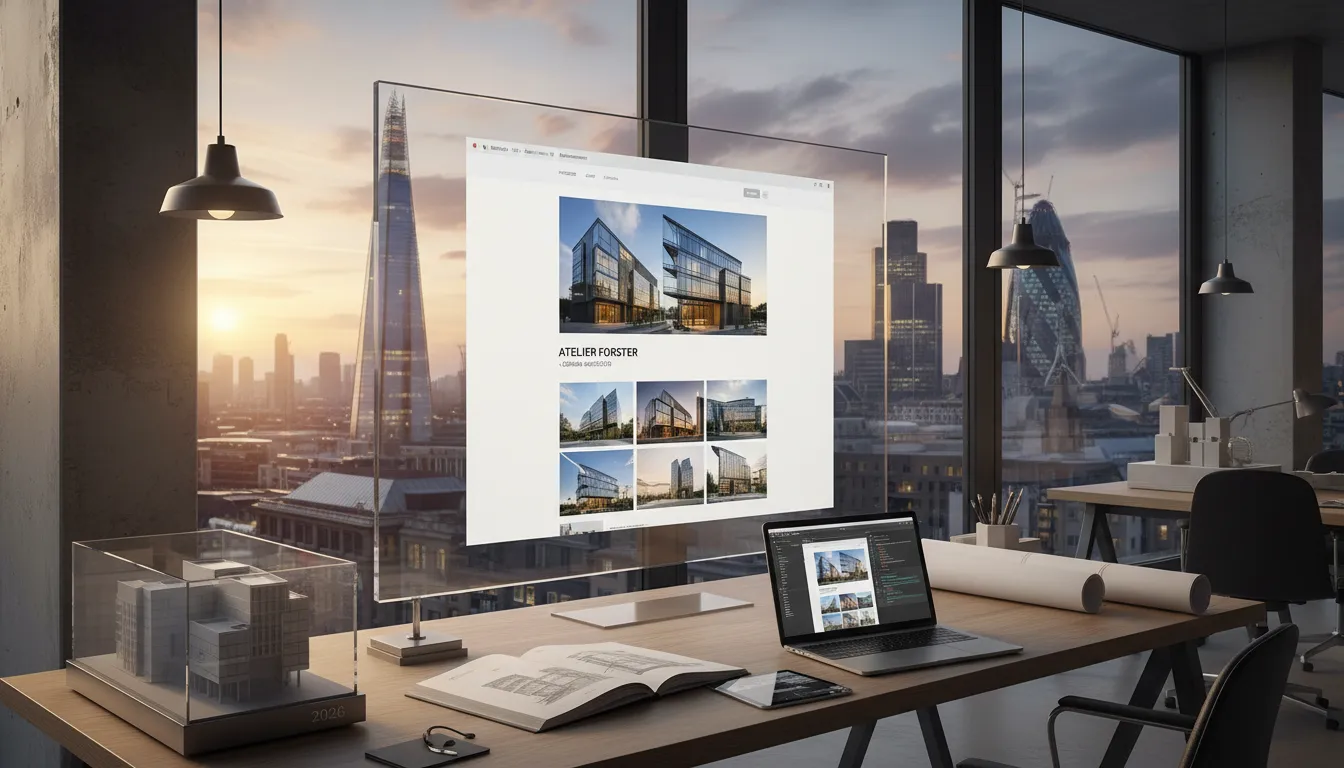
Your hero section should also include a hero image or background video. This should be relevant to your business. A boutique retailer in Notting Hill might show their storefront. A professional services firm might show trusted team members. A fitness business might show a energetic class in action.
The image should be high-quality and professional. Blurry photos or stock imagery that looks obviously generic tank conversions. Real photos of your actual business, your team, or your customers perform better.
Size matters too. Your hero section should take up 60–80% of the viewport on desktop. On mobile, aim for 100% to ensure it fills the screen. This forces focus on your core message.
Trust Signals and Social Proof: Building Instant Credibility
London visitors are skeptical. They’ve seen countless websites. Many are trying to sell them something. Your job is to quickly demonstrate that you’re trustworthy and that other people like them chose you.
This is where social proof becomes crucial for homepage conversion.
Types of Trust Signals to Display:
1. Client Logos
Display 3–5 logos of well-known clients or brands you’ve worked with. Even if they’re not household names, logos create visual trust. For regional businesses, this might be other London companies or well-regarded local brands.
2. Testimonials and Case Studies
Feature 2–3 short testimonials from real clients. Include a photo, name, and business. Video testimonials are even better—they increase perceived credibility by 72% compared to text-only testimonials.
Example: “Web Design London redesigned our site in 6 weeks. We’ve increased inquiries by 40% and saved hours each month on admin. Worth every penny.” – Sarah Mitchell, Owner, Notting Hill Boutique
3. Awards and Certifications
If you’ve won awards or hold relevant certifications, display them. Examples: Google Partner, Trustpilot Certified, Industry Awards, Professional Memberships.
4. Numerical Social Proof
Statistics carry weight. Display relevant numbers:
– “Trusted by 200+ London Businesses”
– “4.9-Star Average Rating (127 Reviews)”
– “98% Client Satisfaction Rate”
– “Average 34% Increase in Inquiries Within 90 Days”
5. Trust Badges and Security Symbols
Include SSL certificates, payment security badges (if e-commerce), and any industry-specific certifications. For professional services, mention your memberships (Law Society, Chartered Institute, etc.).
6. Recent Client Wins
A section showing “Recently Completed Projects” or “Recent Success Stories” creates momentum. It signals that you’re actively working and delivering results.
Where should these go on your homepage? Ideally, position them above the fold or in the section immediately following your hero. The goal is to build credibility before asking for a conversion. Trust → Action. That’s the equation.
Clear Navigation: The Silent Conversion Driver
Your navigation menu might seem like a small detail. It’s not. Poor navigation is a silent conversion killer.
Your navigation should have 4–6 main menu items maximum. Anything more creates cognitive overload. Visitors shouldn’t have to think about where to go.
Essential Menu Items for Most London Businesses:
1. Home – Always include this.
2. About/About Us – Why should I trust you? This answers it.
3. Services/Products – What do you offer?
4. Portfolio/Case Studies – Proof that you deliver. (For service businesses)
5. Contact/Contact Us – How do I reach you?
6. Blog – (Optional, but good for SEO)
For specific industries, you might adjust:
– E-commerce: Home | Shop | About | Blog | Contact
– Professional Services: Home | Services | About | Case Studies | Contact
– Local Services: Home | Services | About | Testimonials | Contact
Your navigation should be sticky or fixed at the top, meaning it stays visible when users scroll. This ensures your primary CTA and contact information are always accessible.
On mobile, use a hamburger menu (three horizontal lines) to save space. Ensure it’s easily tappable (minimum 48px height).
Avoid dropdown menus if possible. They work poorly on mobile and create friction. If you must use them, limit nested items to 2–3 levels maximum.
The styling should be consistent with your brand. Navigation text should be easily readable. Links should have a clear hover state (color change, underline, etc.) so users know they’re clickable.
One often-overlooked navigation element: breadcrumbs. For pages deeper than your homepage, breadcrumbs (Home > Services > Web Design) help users understand where they are and navigate back.
Value Proposition and Differentiation: Why Choose You
By the time a visitor scrolls past your hero section, they know what you do. Now they need to understand why they should choose you specifically.
This is your value proposition section. It answers: “What makes you different?”
For London businesses, this is critical because the market is crowded. There are hundreds of web designers in London. Thousands of accountants. Dozens of boutique retailers on the same street.
Your value proposition should be 2–4 sentences maximum. It should clearly articulate:
1. The Problem You Solve – What pain point do you address?
2. Your Unique Solution – How do you solve it differently?
3. The Result – What can clients expect?
Example for Web Design London:
“Most London businesses struggle with outdated websites that don’t attract customers. We design conversion-focused sites that showcase your value and drive inquiries. Our clients see a 34% average increase in inquiries within 90 days.”
This section often works well with visual elements. A comparison table showing “Before/After” metrics is effective. So is an icon-based breakdown of your advantages.
Format Option 1: Three-Column Layout
– Column 1: Icon + Benefit + Brief Description
– Column 2: Icon + Benefit + Brief Description
– Column 3: Icon + Benefit + Brief Description
Format Option 2: Narrative + Statistics
– Left side: Paragraph explaining your unique approach
– Right side: 3–4 statistics supporting your claims
Real data performs better than vague claims. Instead of “We deliver quality,” say “Our designs score an average of 92 on Google PageSpeed Insights.”
For luxury brands in Kensington or boutique services in Fulham, this section might focus on exclusivity, personalization, or bespoke service. For family businesses in Wandsworth, it might emphasize local expertise and personalized attention.
Services or Product Overview: What You Offer
Your homepage should provide a clear overview of what you offer. This doesn’t mean listing everything—save detailed pages for that. But visitors should understand your main offerings.
The most effective format is a 3–6 item showcase. Each item should have:
1. A Clear Icon or Image – Visual recognition matters.
2. A Service/Product Name – What is this?
3. A One-Sentence Description – What does it do?
4. A “Learn More” Link – Drive to detailed pages.
Example for a Professional Services Firm:
– Corporate Tax Planning – Optimize your tax position and keep more profits. Learn More →
– Payroll Management – Simplified payroll for growing teams. Learn More →
– Business Accounting – Monthly financial clarity and compliance. Learn More →
Avoid overwhelming this section. Six items maximum. Any more and you dilute focus.
This section should use visual hierarchy to guide attention. Icons should be consistent in style. Text should be scannable. Each offering should connect to a dedicated page on your site.
For e-commerce, this might be “Featured Products” instead. Showcase 4–6 bestsellers with images, prices, and “Add to Cart” buttons.
Contact Information and CTAs: Multiple Paths to Conversion
Your visitors are at various stages of the buying journey. Some are ready to buy. Some need more information. Some are just curious.
Your homepage should accommodate all three.
Essential Contact Elements:
1. Primary CTA Button (Already discussed in hero section)
This should be your highest-priority conversion goal. Book a Call. Request a Quote. Start Your Project.
2. Secondary CTAs (Placed throughout the page)
Examples: “Download Our Free Guide,” “See Case Studies,” “Book a Demo,” “Schedule a Consultation”
3. Phone Number (If applicable)
Make it clickable on mobile. This seems obvious, but many sites still fail here.
4. Email Address
Provide at least one email address. Consider creating a specific email for inquiries: hello@yoursite.com or inquiries@yoursite.com.
5. Contact Form (Dedicated section or footer)
Keep it short: Name, Email, Phone, Message. Any longer and form abandonment increases. For some businesses, a dedicated contact page is better—link to it from the homepage.
6. Business Hours (If location-based)
Transparency builds trust. Show when you’re available.
7. Location (If you have a physical location)
For London businesses, mention your area. “Based in Kensington” or “Serving all of London” matters. Include a Google Map embed if you have a physical office.
8. Social Links
Include links to your active social media profiles. If you’re not active on a platform, don’t link to it—an empty profile looks worse than no profile.
The placement of these elements matters. Your primary CTA should be in the hero section (above the fold). A secondary CTA should appear mid-page. Your contact form or contact section should be prominent near the footer.
Some London businesses benefit from a “floating” contact button that stays visible as users scroll. This is particularly effective for businesses with phone-based sales (consultancies, agencies).
Testimonials and Case Studies: Proof That You Deliver
By this point, your visitor understands what you do and why it matters. Now they need proof that you actually deliver.
Testimonials and case studies serve this purpose.
What Makes a Great Testimonial:
1. It’s Specific – Not “Great service!” but “They increased our website traffic by 45% in 3 months.”
2. It Includes a Photo – Faces build trust. A real photo of the person giving the testimonial is 5x more effective than text-only.
3. It Includes Their Name and Title – “Sarah Mitchell, Owner, Notting Hill Boutique” is more credible than “Anonymous.”
4. It Mentions a Problem They Had – Context matters. “Our old website was costing us customers. These guys redesigned it, and we’ve been swamped with inquiries ever since.”
Video testimonials outperform text testimonials by a significant margin. If possible, record 30–60 second video testimonials from satisfied clients. These create immense credibility.
Case Study Structure:
A case study is deeper than a testimonial. It tells a story:
1. The Challenge – What problem did the client face?
2. The Solution – How did you solve it?
3. The Results – What metrics improved?
4. The Quote – A testimonial in the client’s words.
Example Case Study Headline